
Searching for new UI metaphors
There were few visual interface developments which stood out at Mobile World Congress, not least because the small application developers at the forefront of UI experimentation were noticeably absent. This may be due in part to the increased cost of travelling to Barcelona and participating in the congress, but I suspect the main reason is the other attendees no longer represent an app developer’s market.
A few years ago, small app developers would court network operators and handset manufacturers, hopeful of a licensing deal to access the mass market. Today, new sales channels – app stores – dominate. Success is determined more by a developer’s own ability to target customers than by distributing through operator decks or handset bundling.
There were two examples of UI innovation which impressed me. One was Nokia’s new ‘slide to zoom’ gesture on the PureView 808 handset (more on that in another MEX article). The other was Ixonos‘ multi-pane tablet UI.

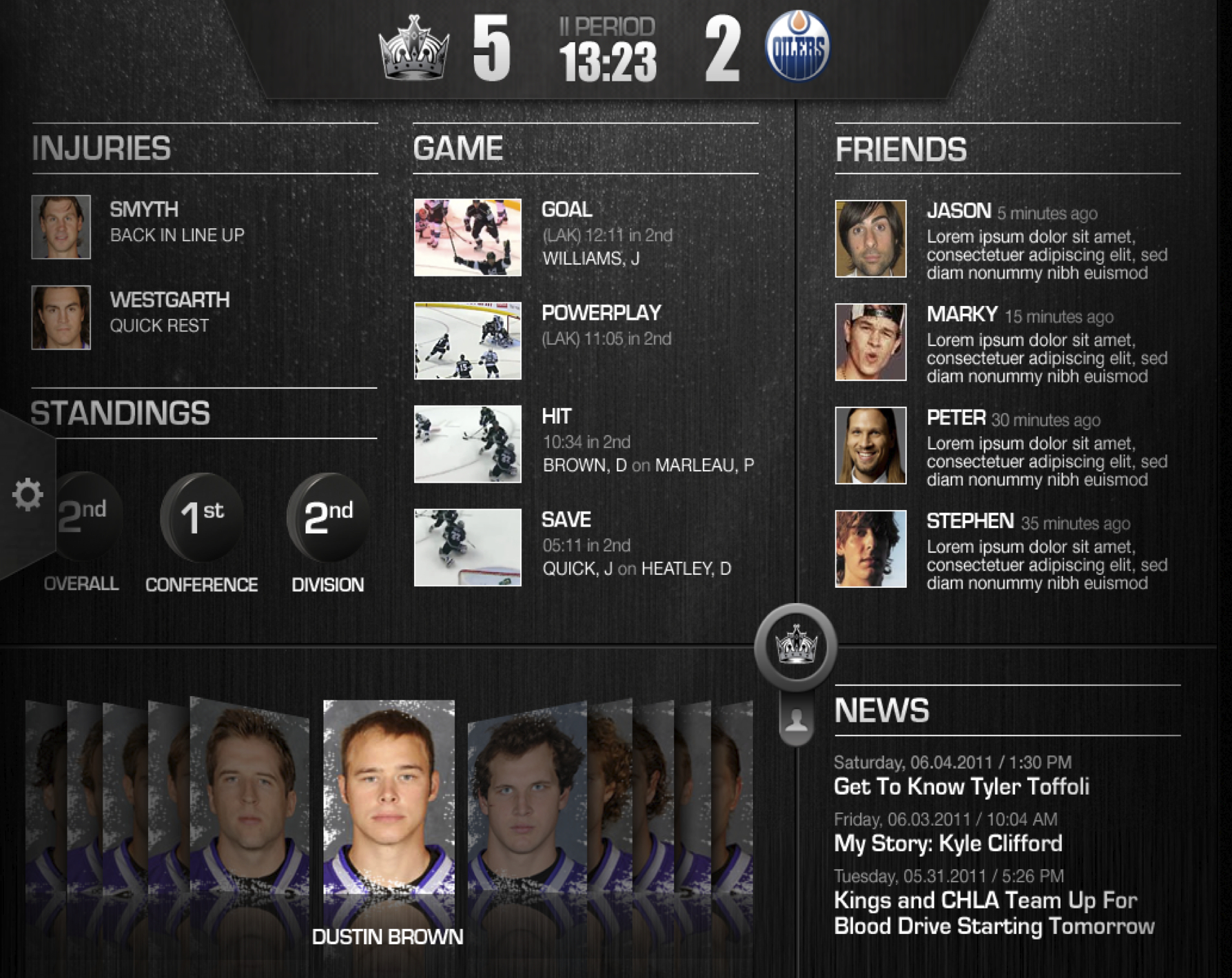
Sami Paihonen, Head of User Experience at Ixonos, explained the behavioural insights which drove the design. The Ixonos team had observed the trend of tablet usage combined with TV viewing and seen how the complexity of navigating between application silos focused on a single function was a source of frustration. For instance, a user watching a sports game would have half their attention on the TV screen and the other half divided between flicking through social media feeds to chat with fans, a web browser to see scores and stats from other games and their team’s own branded app.
Ixonos’s solution was to build a a multi-pane, user customisable canvas to bring together all these elements in a single app. The canvas’ total conceptual size is larger than the device screen, but instead of panning around it, users slide a cross-hair axis to reveal as much or as little of each pane as they require.

There are several benefits to this approach. In a scenario where the user’s attention is already divided between TV and mobile device, it minimises further attention division within the device itself by centralising everything within a single interaction language. In addition, the user gains control over which components are most important to them and can adjust their focus between chatting with other fans or keeping on top of the latest game stats.

Ixonos is patenting this UI and using it as a template to build apps for sports clubs. They’ve already done it for a Finnish ice hockey team and an as yet unannounced, but very well known, European football club.
Paihonen also demonstrated a new handset reference design they’d created, built around two central concepts: speed and natural, paper-based metaphors. Photos peeled upwards like sheets of paper torn from a pad of Post-It notes, while message feeds were printed on a concertinaed ticker tape, which could be folded with a pinch. Despite the skeuomorphic techniques, the design was refreshingly minimalist, with few of the textures and cliches which dog the corkboards, leather journals and whiteboards typical of the genre.
Most impressive of all, however, was how Ixonos optimised the 3D rendering so that the interface worked just as smoothly on Paihonen’s high-spec reference handset as it did on an off-the-shelf, single core 800 Mhz Samsung device running Android.
“Ixonos is patenting this UI ” – I hope they get shot down in flames for that; this is a nice piece of UI but it’s something that has prior art going back 20 odd years.
Equally, most of the items in their demo reel we’ve seen before in published iOS apps in identical form, going back 2 years, none of which I believe involved Ixonos.
It’s great that they’re playing with nice UI … but to then try and patent the obvious? That deserves contempt.