

Exploring quiet design, sensory interfaces and human factors at Made in Brunel

Last weekend the MEX collaboration with Brunel University saw us experimenting with a new type of open workshop at the Bargehouse on London’s Southbank. It was hosted as part of Made in Brunel, the multi-day event organised annually by students to showcase their projects and develop links with industry.
You can read all about the results of these workshops below, but first some background on Made in Brunel and the winners of the Brunel human-centred design award MEX supported.
Human-centred design at Brunel
I was introduced to Made in Brunel more than 5 years ago and what I saw on that first visit impressed me, prompting a long-standing partnership with the university. Since then successive teams of Brunel students have participated as designers and supporting facilitators at our MEX events, leading a growing number of them into professional roles in the user experience community.
I had a chance to explore some of this year’s exhibits before our workshops started and was once again delighted by the quality of the students’ projects.
Amy Huckfield showed me how her interest in design research led to a concept for helping parents, teachers and children themselves gain a better understanding of attention deficit disorders (ADD). Amy discussed the challenges of conducting design research in this environment and striking the fine balance familiar to all ethnographers, whereby the researcher should observe but not unduly influence the situations in which they find themselves.

She applied her research to propose a digital bracelet capable of tracking childrens’ levels of intellectual stimulation through skin response and mapping those data against factors such as the school timetable and teaching methods. The goal is a more granular picture of when and why children have peaks and troughs in their attention, helping the children and their carers to better understand the right methods and focus areas to improve future learning.
Amy was awarded third prize in Made in Brunel’s Human-centred Design Award, sponsored by MEX and judged by lecturers from the university.
Brunel’s Brand Futures scheme sees students working in partnership to develop future concepts for companies. James Burchill guided me around a project a team of fellow students worked on with Sony. It was part of a larger effort within Sony to define a vision for 2020. The Brunel team centred on how to manifest users’ digital identities across several devices, from their first toys to the work tools they might use in later life.
The Brunel design embodied the user’s identity in a physical token, with the weight, appearance and value of a small, smooth pebble – each with its own fingerprint of unique colours and patterns. The token itself would have little digital intelligence, but instead link to the user’s virtual space of media, documents and preferences.
The element I enjoyed most was the sculpted digital sharing bowl the students envisaged, where family members could deposit their tokens when they returned home. As family members gathered in the house at the end of each day, the act of placing a token in the bowl might prompt the virtual sharing of certain memories from each person’s day, displaying them on a central screen in the home. It seemed a refreshingly collegiate use of technology at a time when mobile devices are often seen to play a divisive, isolating role within families by allowing each person to withdraw into their own worlds and ignore even those sitting next to them on the sofa (a point at the heart of Sherry Turkle’s book, Alone Together, highlighted at previous MEX events).
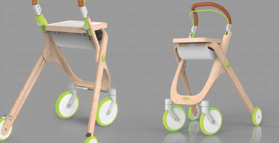
While digital solutions were prevalent, there were many other examples of human-centred design, including Ben Clarke’s mobility aid for the elderly. It was brought to my attention by one of our workshop participants, the grandmother of a Brunel student, who had personal experience of current mobility aids, like the ubiquitous, boxy metal ‘zimmerframe’, and picked out Ben’s alternative as the highlight of the show for her. A crucial element of the new design was the inclusion of an integrated tray, allowing both hands to remain on the supports, while still being able to carry items around the house. She was also impressed by its turning circle, something she pointed out as vital for those with smaller living spaces, where traditional zimmerframes were cumbersome to manoeuvre.
Ben’s design was awarded first place in the human-centred design category.

Another of the Award winners, Katharine Redhead (who took 2nd-equal prize), had experimented with a playful thermochromatic interaction to help children establish the correct writing grip. Katharine wrapped the grip area of an ergonomic crayon in a thin, thermochromatic film, which responded to the heat of a child’s grip by revealing a pattern showing where the best finger position was located. Instead of arrows or arcane symbols, Katharine used a pattern of dots, which gradually morphed into hearts the closer fingers came to the correct placing. A simple, elegant and charming idea.

Nicola Westgarth-Flynn, who shared the 2nd-equal prize in the human-centred design category, also focused her project work on children, this time at a younger age. Her design – Joey – is a system of plastic cups and lids to help parents feed babies homemade food with the same convenience levels of supermarket-purchased pouches. As many new parents will attest, the ease of these pouches and the way they allow children to feed themselves often overrides concerns about their relatively high cost and the inability to fill them with homemade nutrition.
The design of Joey hinges on the airflow design Nicola researched to ensure food flows easily through the spout and into the child’s mouth.
It was a pleasure for MEX to sponsor the award in human-centred design and recognise a diverse range of design talent. The unifying factor, of course, was the designers’ ability to empathise with their users – often across generational gaps – a skill that all our work at MEX is geared towards improving within digital industry.
Imagining a quieter digital world

This was also evident in the first of the open workshops on Saturday afternoon at Made in Brunel. These sessions were a new departure for MEX, collaborating with Brunel student designers (who had participated at previous MEX events) to identify elements of MEX Pathway topics we wanted to explore in a broader, public forum. We were delighted by the diversity of participation, including three generations from a family visiting their daughter/granddaughter’s project showcase in the exhibition, to masters-level students and high school children interested in a future design career.
The first challenge looked at the theme of MEX Pathway #13: quiet design. The number of hours humans spend staring at screens is starting to outnumber those where our eyes are engaged elsewhere. Quiet design represents a broad set of principles to reduce the visual noise of digital interfaces. It is tempting to see this simply as a form of visual minimalism, but previous research into this Pathway has found it to be more than that: a sense of calmness, comfort and control which pervades all elements of a digital experience, from the visual to the audible.
After a brief introduction, where I showed a few examples of digital noise and some possibilities for quietly designed antidotes, we split into three teams, facilitated by Brunel students Ollie Taylor, Nicola Westgarth-Flynn and Heather Park.
Each team was tasked with identifying how the flow of messages we receive in our daily lives could be separated into two classes:
- Notifications which require no immediate attention and should be explored at leisure.
- Urgent items which benefit from a timely response.
The goal was an hour-long ideation exercise to envisage a user experience flow for this separation.

Participants in my group, facilitated by Heather Park, spanned a 50 year age range. We started by sharing the diverse personal experiences of ‘noise’ in our lives. I was surprised how everyone, even those with little connection to the web, felt overwhelmed by digital communications at times. For some, it was automated marketing calls interrupting meal times on their fixed line phone, for others it was the fear of email accumulation on holiday. It also affected both private and public spaces, with two of our participants describing the constant, but indecipherable, announcements made at train stations. The digital voices and ‘one way’ nature of the communication made finding the information they needed to complete their train journey difficult and stressful.
Everyone had their own coping strategies, from employing multiple email boxes to limiting the amount of time spent with digital interfaces prior to bedtime in an attempt to improve the quality of sleep.
We dissected these personal stories to identify common characteristics which made digital experiences feel ‘noisy’:
- Non-stop – e.g. a stream of information with no defined end point
- Overloading – e.g. delivered faster than a user can process
- Irrelevant – e.g. unsolicited or poorly timed communication
- Difficult to see or hear – e.g. visual clutter and audible distortion
- One-way communication – e.g. where the user feels they cannot converse with the system in a human way
- Unmanageable – e.g. cannot be customised to the user’s preference
- Contagious – e.g. causes a ripple effect which distracts from other tasks or affects people who are trying to do other things
We then returned to the personal experiences shared earlier to identify a common problem to solve through rapid ideation. The desire for a time when we could switch off entirely from the digital stream was universal. We focused on the example of holiday time and how we could ensure ‘time off’ was freed from the worry of accumulating more digital noise, while being reassured that a truly urgent message (e.g. a family member in distress) would still reach us.
The heart of the problem seemed to be the homogenous way most digital systems treat notifications. For instance, current mobile operating systems make no distinction between the hundreds of new posts from web-sites we follow and urgent messages from loved ones: they all appear in the same seemingly endless stream of notifications.
The team mapped a system to improve two things:
- A filtering layer universal to all communication channels, so everything from voicemails to instant messages could be evaluated for relevance. Crucially, the filter should notify those sending messages that the receiver was ‘away’ and allow the senders themselves to re-evaluate the urgency of their communication. For instance, someone who had sent a general email enquiry, would receive their message back and the opportunity to attach a ‘please respond by’ date. The filter was not a particular piece of technology, but rather a concept which would be determined by the user themselves. A premium option might be an actual human assistant, while freely available context aware filters – similar to Google’s Priority Inbox – could serve the needs of those on smaller budgets.
- A notification mechanism which gave users control over how a notification happened, if it was deemed sufficiently urgent by the filtering layer. Some might choose to have a ‘red phone’ capability, where the network only allowed their phone to ring for truly urgent calls. For others, it might be the nomination of a trusted individual to actually come to them in person with a particularly urgent message.
Ollie Taylor’s team look at how dimensions of relevance could be established through context awareness techniques, following a similar theme of how notifications could be categorised in a more nuanced way. They felt automated pattern recognition was becoming sufficiently advanced to facilitate this.
The team described how they were seeking to create the same ‘moment of tranquility’ you experience when getting into a car and closing the door, but before you’ve switched on the engine or start your journey.
They got further into considering how a digital interface might indicate the relative priority of messages, identifying a concept of floating bubbles, where the bubble size and persistence conveyed its importance. Analogies were drawn with the almost universal feeling of satisfaction we all experience when popping bubble wrap. Their proposed interface sought to recreate that sensation, so that dismissing unimportant notifications would seem less like a burden.
Nicola’s team generated a broad range of ideas to cope with the overload of digital noise in user’s lives, including:
- An on demand mode, using eye tracking technology to ensure low priority notifications only appeared once you started looking at the device, indicating you were ready to actively engage with the digital world.
- Swiping down for high priority and up for low priority notifications, separating the traditional notifications panes found on iOS and Android into separate tracks accessible from different zones of the touchscreen.
- Adapting the sounds used for notifications in response to the user’s environment.
- Subtly changing background colours to indicate the arrival of low priority notifications rather than surfacing them immediately.
- Mood profiles allowing users to actively indicate the level of engagement they wanted with their digital environment.
It was impressive to see the breadth of responses emerging from the groups in the relatively short amount of time allocated (about 75 minutes in total). All the more so because we had deliberately encouraged participation from those other than the experienced designers who attend our twice yearly MEX events.
Turning up the temperature of digital design
Later in the afternoon we convened a second workshop, facilitated by Brunel designer James Burchill, to look at MEX Pathway #9 on multi-sensory digital interfaces which go beyond simply visual interactions. It is a theme which consistently generates interest in the MEX community, even among those who by their own admission come primarily from a visual design background.
Most previous MEX sessions on this topic have explored sound and tactility as the primary alternatives to visual interactions on digital devices. However, the goal of these collaborative workshops was to broaden the discussion and the group found an unlikely alternative direction emerging: temperature.
The team, smaller in number than the morning session and comprised mainly of those with design backgrounds, started to question whether the ability to manipulate temperature within digital experiences could add a new dimension to the interaction palette. The ideas came thick and fast, but first we also established that temperature itself had numerous variables:
- Where on the body it was experienced. Different body parts are more sensitive than others and some are associated with very specific temperature sensations, like ‘a shiver down the spine’.
- Individual sensitivity. Everyone feels ‘hot’ and ‘cold’ at very different temperatures, leading to the frequent disagreements on where the thermostat should set between people who share a house.
- Relative change. How much fluctuation is required before someone notices a change in temperature.
- Illusion. Perception of temperature is not always an absolute physical characteristic, but can instead be governed by the moods created by light (e.g. diffuse, yellow lighting for warmth) and smell (e.g. bread, coffee and cinnamon – all associated with warmth and comfort).
Each participant was asked to sketch out a rough concept for a scenario where the ability to manipulate temperature could enhance a digital user experience. Some of the ideas included:
- Indicating the flow of background notifications using side-mounted LEDs on a touchscreen device to create an ambient colour temperature.
- Alerting drivers to the relative safety of different sections of road (safety data are now available for most roads in the UK) by changing temperature of heated seats and air conditioning, backed up by a system of vibrations and visual alerts.
- Highlighting food approaching its ‘best before’ date within a fridge by using focused LED light spots to create zones of colour ‘temperature’, such as hot red for items which needed to be consumed within 24 hours to cool green for food which would be good for another week.
- Communicating emotion from absent loved ones using a hidden neck wrap, capable of delivering a warm glow when a certain message type was received.

The workshops were faster and less structured than the two day, themed and prepared sessions we run at the twice yearly MEX events, but the results no less interesting. Indeed, the opportunity to collaborate with Brunel and a diverse range of participants in an open, free-to-attend session was rewarded by fresh perspectives on two themes, quiet design and sensory interfaces, which are of growing importance in mainstream digital design.
Special thanks to Brunel designers Ollie Taylor, Heather Park, Nicola Westgarth-Flynn, Amy Huckfield, James Burchill and Kat Harris for their organisation and support on the day.
[…] Last year we also worked with students to organise a day of workshops at Made In Brunel exploring the notion of quiet design and multi-sensory interfaces, a summary of which can be found here. […]