
Where is the colour in the monochrome mobile industry?
Amid the aesthetic assault and branding riot of the trade show floor, I was drawn to NTT DoCoMo’s stand at 3GSM this year. The gaudy, diverse colours of the handsets on display lured me from the aisle and proved sufficiently distracting to make me late for my next meeting.
DoCoMo’s collection was displayed in glass cases like precious jewellery. There were reds and yellows, stripes and polka dots, finishes in gloss and matt – such variety!
I thought to myself: “Surely these can’t be DoCoMo’s standard range?” Unfortunately I didn’t have time to speak to anyone on the stand, so I did some investigating once I got back to the office and it turns out these are indeed part of the operator’s public offering.
If I’d spent more time in Japan recently perhaps I wouldn’t have been so surprised. As I’ve expanded my research into this, I’ve found these multi-coloured handsets are very much the norm in the Japanese market.
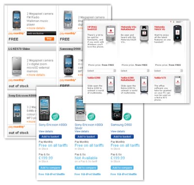
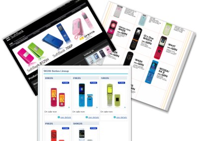
The contrast with the UK and other Western European markets is remarkable. To illustrate this, I’ve captured screen shots from the web-sites of the 3 largest operators in both the UK (Vodafone, O2 and Orange) and Japan (DoCoMo, KDDI and Softbank). They show the most popular 3G devices offered by each company.
UK
Japan
The handsets available to UK customers rarely step outside the familiar monotony of monochrome: black, grey and white. There are occasional metallics – silver or bronze – and a few pink handsets, no doubt designed by men for a female market they are clearly out-of-touch with. Also, each handset is typically only available in a single colour option. This is sometimes customised for the invididual operator, to differentiate Nokia’s on O2’s network from Nokia’s on Vodafone’s network.
Can you imagine a car manufacturer only selling vehicles in it’s corporate colours? If you wanted a blue car, you would have to go to Ford and if you wanted a red one you would go to Honda.
In Japan, almost every handset sold is available in at least three colour options. These range from lime green to banana yellow.
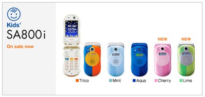
This product for young teenagers is available in five variations of two-tone colour.
The marked difference in the palette of colours available to customers in these two markets got me thinking about how this might affect the user experience. From a purely personal perspective, I found myself much more drawn to the Japanese offerings. The variety of colours created a feeling of desire totally absent when looking at the monochrome ranges offered by the UK companies.
Research has been conducted on the effect colours have on our emotional state. Richard Keller presented the findings of a 1976 study in a paper entitled ‘The Use of Space–Some Physiological and Philosophical Aspects’ at the Third International Architectural Psychology Conference, University Louis Pasteur, Strasbourg, France. His experiment involved separate groups of six men and six women, who were placed in a room with a grey colour scheme and a one with a colourful, complex scheme.
Keller recorded the pulse rates and subjective reactions of both groups. Pulse rates were higher for both men and women in the grey room, while men also reported themselves more bored and stressed in the grey room.
This article by Natalie Khouw of ‘Color Matters’ provides more background on how colour affects our emotions, particularly the difference in reactions between men and women.
Clearly most of us react to colour. It is one of the key ways we demonstrate our identity to the world: our clothes, the interiors of our houses, our cars and even the colour of the make-up we wear tells others about our style preferences and our moods.
It has always amazed me the mobile industry has largely failed to capitalise on this most basic of personalisation opportunities.
Expanding the range of colours in a product portfolio is not without its challenges: how do you manage stock control to ensure you don’t over-supply the least popular colours? How can you ensure your colour scheme remains unique? How do you plan colour options for international markets where local culture might incline the population towards particular hues and rule out others?
However, it is clearly achieveable, as the Japanese example demonstrates. Perhaps the answer is in the different structure of the Japanese value chain? The unique relationship between handset manufacturers and network operators in Japan is well documented: the carriers exercise far more control over handset design and specifications, providing the manufacturers with detailed guidelines on all aspects of the product, jointly investing in new technologies and supplying customised software platforms.
In contrast, most Western operators look to the manufacturers to innovate their own designs and then tweak the software, interface and some basic branding elements for individual networks.
I find this bizarre. In the Japanese market, where network operators have the dominant role, there are a diverse range of handset colours. In most western markets, where manufacturers have greater influence, the colour options are far more limited. Colour adds value to the hardware brand relationship, so why are device vendors failing to seize this opportunity to enhance their relationship with the consumer in markets where they have the greatest potential to influence specifications?
There are examples of manufacturers experimenting with colour in the UK and other developed Western countries. Motorola, for instance, extended the longevity of its RAZR range by offering the device in red, blue, gold, pink and bronze. It’s PEBL handset was also offered in a range of colours.
Nokia updates its ‘fashion collection’ on an annual basis, offering handsets in a patterned mixture of pink, beige and gold (yes, it is about as hideous as it sounds). Palm also offered an exclusive range of orange, red, white and grey when it launched the Treo 680 smartphone, reserving the colour options for customers who purchased direct from the manufacturer. However, it recently agreed a deal with AT&T, which will see the US operator become the exclusive distributor for the colour editions.
Manufacturers certainly aren’t oblivious to the potential of personalisation. Many – like Nokia and Sony Ericsson – have offered numerous handsets with replaceable fascias, allowing users to choose from an almost infinite range of different designs. Visit any electronics or accessories retailer in London and you’ll find fascias decorated with everything from the England flag to pictures of famous singers.
However, these have tended to be low-end devices aimed at younger customers. There is also something inherently cheapening in the process of removing the case from your handset, revealing its circuit boards and bodging the new fascia together. There’s a strong analogy with the drawing back of the curtain in the Wizard of Oz – the sense of mystery and the value associated with your sleek new handset vanishes in the DIY nature of the activity.
As a first step, I’d like to see every mobile handset offered in at least 3 distinct colours as a matter of course – and I don’t mean black, grey and white. Manufacturers should seek to develop their own palettes, in the same way FMCG brands and vehicle manufacturers protect their unique colour options. As a product comes towards the end of its lifecyle, there will also be opportunities to offer limited editions, like Motorola’s pioneering approach with the RAZR.
I think there is also an opportunity to expand this further by providing customisation at the point-of-sale as a value added service. How much would a customer be willing to pay to receive their handset in a unique colour? Personally, I’d be willing to pay a fairly significant premium – say GBP 20 – for this option.
The key would be the way in which it was offered – the customer should pick the colour from a swatch book, indicate their preference to the retailer and then wait a few minutes while the handset is customised out-of-sight in a workshop at the back of the store. The device would then be presented in its box and the sense of value and mystery would be preserved – the Wizard would remain hidden by his curtains. It’s all about the value of the experience (see my previous research note entitled ‘A vision for the retail experience‘).
This customisation process would be easy with snap-on fascias, but many of the latest thin handsets are the product of advanced manufacturing techniques where modular plastics fascias are not an option. To personalise these devices at the point-of-sale would have an impact throughout the value chain. The devices would have to be supplied to the retailer in kit form, requiring a change in the manufacturing process. The retailer would also need to hire technicians with a certain skill set and there would be capital expenditure on customisation equipment.
This is something where manufacturers could take the lead. Nokia, Sony Ericsson and others are opening flagship shops in key retail locations around the world. They could combine these direct customer touchpoints with their control of the manufacturing process to offer an exclusive in-store customisation service where users can choose from a wide range of exterior finishes.
We’ll be exploring many of the issues surrounding personalisation, both from a value chain and retail perspective, at the MEX conference on 2nd – 3rd May 2007. Cliff Crosbie, Global Director of Retail Marketing at Nokia, will deliver a keynote presentation on the importance of understanding the breadth of customer experience. There will also be a panel session responding to our manifesto statement about embedding personalisation throughout the value chain – speakers include Hampus Jakobsson, Vice President of Marketing, TAT, Dr Nick Alcott, CTO, OMTP and Herbert Vanhove, Vice President and General Manager, Qualcomm Internet Services & MediaFLO Technologies.
To join us for the debate, register to attend the conference here (delegate places are priced at GBP 1349).
See also the previous research note entitled ‘A vision for the retail experience‘.
I couldnt agree more! Selling is ALL about giving the buyer what THEY want. You would think the “build it [to our OWN specification] and they will come running” idea would have died a death by now. The consumer may not ALWAYS know what they want but they ALWAYS know what they dont want – and they also know where to go next time to get what they want (ie. all the functions (most of which arent used) but not the colours; next purchase, less function and the right colour.) I’ve even SEEN it happen (in colour!) but the principles also apply to pretty much anything – nee, everything! Its about letting the consumer choose.
In Europe today grey and silver is the new black but we forsee this to change quite rapidly.We have a whole division that studies colour and material trends in mobile handsets and I agree strongly that colour has a strong impact on the buying and usage of handsets.
Good write up, well done !
Abhi Naha- Vice President Global Sales and Marketing
MBA (Mkt) BSc (Hons)
Idem
Very interesting, Marek, well researched.
However I think you might have overseen an important point: in Japan handset vendors have little flexibility about what features they include in their handsets, because carriers specify platform levels that define very precisely the SW features, applications and man-machine interface elements for each handset platform (or “generation”). See for instance KDDI, today promoting the “43” platform, after “42” and “41” last year. Note that handsets naming are build around the carrier platform: “W43SA” is a Sanyo handset of gen 43, “W41SH” is a Sharp handset in the 41 platform. Buyers chose the feature level based on the platform. Then they look at… mechanical design and colors. In effect, the screen size and resolution, the keyboard layout, the inclusion of cameras, MP3 players, TV, etc., almost everything is specified at platform level, down to the OS and user navigation experience. This leaves very few options to the handset manufacturers to differentiate: tilt/swivel displays, key shapes, and… colors. Hence the variety and creativity. Sound is also left to handset vendors creativity, by the way. In one of your next posts you could investigate why all our western camera phoness only do “click” sounds (or close alternatives) when taking a picture, whereas in Korea and Asia, they do “Su-my” (“smile”) or very pretty ding-dongs…
Food for thought!
Benoit.
Since writing this article, Softbank Japan has announced it is offering its Sharp 812SH handset in 20 different colours from the Pantone colour chart. You can check them out in all their brightly coloured glory at:
http://mb.softbank.jp/mb/en/product/3g/812sh/index.html
this lack of choice on offer has led to a number of small entrepreneurs setting up shops on High Streets’ just selling fascias for phones – illustrating how easy it would be to offer those choices at the point of purchase.
[…] an effective mobile presence system MEX – the strategy forum for mobile user experience Where is the colour in the monochrome mobile industry? This post is a round-up from Marek Pawlowski o […]
[…] k at Golden Swamp to write the summary. She kindly picked up on our piece entitled ‘Where is the colour in the monochrome mobile industry?‘ to feature in her review. Read the rest […]
This reminds me of how weird it felt that all cars in Korea are either black, grey or white. I’m not going to speculate about the reasons for that, though. 🙂
[…] ‘Where is the colour in the monochrome mobile industry?’, Marek Pawlowski’s 2007 article on product colours in the mobile phone business. […]