

Changes in iOS 7 design language

(Click for full size version)
The most significant change in the design language of iOS 7 is not the move away from skeuomorphism, but rather the introduction of spatial layers and a sense of visual depth. Previous versions of iOS existed on a flat canvas: the visual metaphor allowed for the existence of left, right, up and down, but there was no sense of nearer and further.
iOS 7 introduces this concept of navigable depth for the first time.
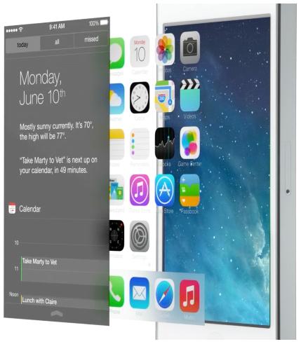
The most obvious example is on the homescreen, where the icons appear to hover above the wallpaper, itself subtly animated with a parallax effect in response to movements of your hand, creating the illusion of depth. It can also be observed in the new Safari, open tabs seem to recede backwards into 3D space. In fact, it is present throughout iOS 7 with varying degrees of subtlety, such as the semi-translucent keyboard, which now floats above content items.

The debate over ‘skeuomorphic’ versus ‘flat’ design which dominated popular reporting of iOS in the lead up to Apple’s 10th June announcement was based on a misconception: these two design styles are not opposite ends of the same scale, but should rather be understood within a broader spectrum of design language. It is more helpful to consider skeuomorphism & stylism as different examples of interior decoration, while flatness and depth represent different architectural structures in which that interior decoration is applied.
The subtle additions of layers we see in iOS 7 are, I suspect, a precursor to a wider use of navigable depth in the future. We’ve been looking at the potential of visual depth in digital user experience for some years already as part of MEX Pathway #4. It is a logical architectural metaphor to enable users’ navigation of more complex digital systems. However, it looks set to be a gradual change in iOS. This is a good thing, given the size of the existing customer base, which will be upgrading to the new version and expecting to continue using their device without having to relearn everything.
Our exploration of visual depth began in earnest 3 years ago, when we introduced MEX Pathway #4 (entitled ‘Identify ways 3D input and output enrich the user experience’), at a time when the first glassless 3D displays were emerging on mobile devices like the Nintendo 3DS. Initial investigations uncovered design principles which remain true and should be considered as developers start experimenting with layers within iOS 7.
There are a number of MEX Session videos exploring this topic. I’d particularly recommend Mattias Andersson, speaking at MEX in December 2010, and Dale Herigstad, speaking in September 2012.
For instance, a consistent finding was that interacting with visual depth through a flat input mechanism like a touchscreen was often confusing and, in several instances, induced uncomfortable feelings of motion sickness and eye strain in users. The problem stemmed from the cognitive disconnect between manipulating visual elements with apparently three dimensional characteristics using fingers constrained to the flat plane of a touchscreen.
Also, there is a common misunderstanding that human vision itself is 3D. Our sight actually limits perception to 2D layers and it is only through physical interactions we explore additional spatial dimensions. For instance, in the physical world, the underside of an item placed on a flat surface is invisible until we turn it over. Limiting freedom of navigation in digital 3D interfaces, therefore, helps them to feel natural.
These characteristics are clearly not lost on Apple’s UI designers and the use of depth in iOS 7 is restrained for those very reasons. It also suggests that further developments of this depth metaphor in visual output will need to be allied to corresponding developments of the input hardware. Which raises an interesting question: how long will it be before we see Apple implementing an input mechanism which allows users to reach into the depths of the interface through pressure or proximity sensing?
As a follow-up to this, @WhatTheBit posted a link to an interesting side-by-side icon comparison for iOS 6 versus iOS 7:
http://images.intomobile.com/wp-content/uploads/2013/06/iOS6vsiOS7_icons.jpg
There’s also a discussion thread going over at the MEX LinkedIn Group:
http://www.linkedin.com/groups/MEX-Mobile-User-Experience-1482257/about
On the theme of pressure sensitive displays, which are one of the ways of responding to depth perception in the input layer, this British company in North Yorkshire has an interesting approach:
http://www.peratech.com/qtc-touch-processing-unit.html
Uses quantum tunnelling composites.
[…] UI change. However, it was wrongly characterised as a move towards ‘flat’ design. As we pointed out at the time, that couldn’t have been further from the truth. While iOS 7 replaced skeuomorphic textures […]