
Design principles for overcoming user apathy
- Strive for zero additional user input when trialling new features
- Reassure users they can revert to the familiar if they don’t like the new
- Establish experimental UI zones to sandbox novelty in a comfortable framework
Most users are creatures of habit. They access features through familiar patterns and become wary of change. This makes it challenging to introduce new capabilities without disrupting comfortable routines.
Furthermore, for designers and developers, the sense of ownership which results from creating services makes it difficult to empathise with this form of user apathy. When it is your product, it is hard to accept that sometimes – even though the new features are objectively better – users may simply not be motivated to try them.
The perceived risk and disruption of any new feature is inversely proportional to its take-up.
This makes it all the more important to double down on ensuring it takes minimal effort to try new features. It is also essential that new features do not interrupt users’ ability to access other, more familiar parts of the experience and they are seen to be reversible.
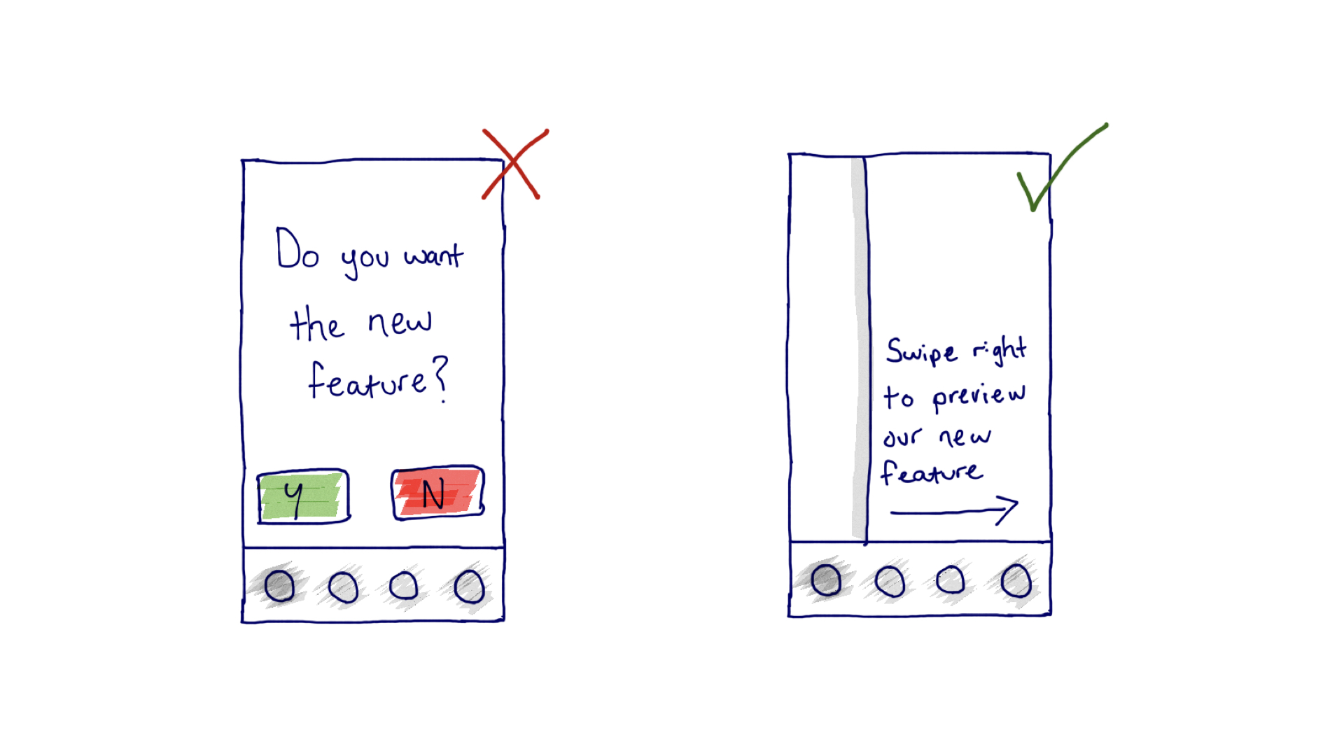
In this sketch example we show the difference between showcasing a new feature with an interrupt screen, versus hinting at the possibility to preview a new feature with a reveal screen. Importantly, the interaction flow of the latter allows the user to maintain visual contact with their familiar UI and slide back to it at any point.
The principle, part of an emerging series in the MEX journal, is summarised below in a tweetable, shareable graphic. Thank you for citing appropriately.

+ There are no comments
Add yours