

Making a case for the seductive promise of zero UI
Glacial is the only word for it. I pressed one of the blue buttons and waited. Somewhere in the mechanical heart of this relic I imagined cogs whirring and a rusted belt chain creaking into action. At length, something happened on the dot matrix-style LCD. Numbers appeared, which bore little or no resemblance to the transaction I was trying to execute, but according to the lengthy printed instructions, were the first of several steps required to pay this company for their service.
Somewhere in the vicinity, I thought to myself, an iPhone user has just paid for their coffee in a fraction of a second using the biometrics and NFC of Apple Pay. Indeed, I had enough time to increase my estimate: I suspect several coffees and a pastry or two had been bought in the period it took this lumbering terminal in front of me to stir into life.

Unhappily, I know this machine and know it well. It is the reason I always leave an extra five minutes to spare when I need to park at the train station. However, there are numerous occasions when I’ve witnessed the uninitiated cursing its inadequacies as they realise they are going to miss their train in the battle to communicate with this beast. There’s nothing like that sinking feeling when it becomes apparent the person in front of you is going to try to pay with a Chip and Pin card. For the love of god, don’t ever attempt to pay with Chip and Pin!
Thankfully the days of interface travesties like this parking ticket machine are numbered. Good riddance I say. Digital progress is ushering in an economic sea change in which these weird hybrids, which have one foot in the mechanical age of the early 20th century and the other 1980s-style computing, will be swept away by integrated systems which are actually fit for purpose.
The notion of the invisible user interface is seductive and a buoyed by rising tide of interest in digital industry. There are entire conferences about it, or so I’m told. It is refreshing to imagine a clever mix of gestural sensors, artificial intelligence and cloud computing power eliminating many of the pointlessly manual interactions still required for humans to interact with digital devices.
The conceptual argument in favour of this ‘zero UI’ movement is easy to make, but elegant implementation is harder to achieve. In the example of parking at the train station, each instance could be billed with literally no user attention whatsoever. A digital camera would scan the numberplate as you arrived and track the time you left. A cloud transaction in the background would complete the process by billing it to a pre-registered account. It’s already happening in many places, of course, but good examples are still the exception, while metal boxes with coin slots remain the norm.
However, it is not in the 80 percent of straightforward instances such as this where invisible interfaces will succeed or fail. Rather it will be at the margins, where exceptional circumstances or unique user requirements will confound the minimalistic approaches which are simple to sketch on a whiteboard, but harder to make stick in the real world.
It underlines the need for a user-centred approach, grounded in the unexpected realities of different field environments, to ensure digital can deliver on its promises sooner rather than later. It should also prompt a wider debate and an extrapolation of such scenarios to fully understand just how extensive and interconnected the impact of digital change could be. Today we could easily build a parking billing system based on numberplate recognition, but tomorrow no one will need to park at the station because their autonomous vehicle will drive itself home while the owner is at work.

In the mean time, there are more basic UI lessons to learn from this example: the letter ‘V’, embossed on the confirmation button of this machine’s keypad, has no natural association for British users. I suspect this is a carry over from France, where this thing was likely designed and ‘Valider’ is found in place of what English-speaking users would know as the ‘Enter’ key. The choice of green and red for the main control buttons, is another simple error – already you’ve caused accessibility problems for the significant percentage of the population affected by colour blindness. Latency, which cannot be conveyed in photos, is probably the most serious UX problem with this particular machine. Every interaction is accompanied by sufficient lag to wonder whether the device has registered anything at all.
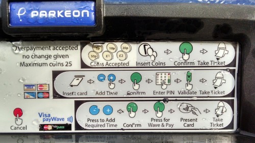
However, above all, if more of a product’s surface is dedicated to explaining the controls than the controls themselves, it is almost certainly time to rethink the whole design approach.
p.s. if you ever find yourself in front of this mechanical terror, the path of least resistance seems to be using a contactless card for payment. It may be the only chance you have of getting your little paper parking ticket before your train pulls away from the station. Your coins will likely be rejected and Chip and Pin seems to initiate a wireless connection to the server to validate the payment over what could very well be a 9.6 Kbs modem extracted from a 486 PC. And, whatever you do, do not ask for a receipt…

+ There are no comments
Add yours