
Uncompromising, comprised

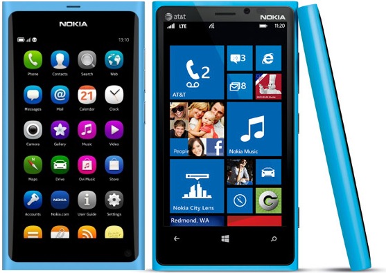
Consider the two products above, the Nokia N9 on the left and the Nokia Lumia 920 on the right. Both employ Nokia’s ‘Fabula’ design language and, at first glance, are so similar as to be indistinguishable. Look closer, however, and which seems the most visually appealing?
The N9, left, resulted from a centralised, uncompromising approach to design – and it shows. Nokia controlled the software, components and external design. There is a notable absence of visual clutter: the contents of the screen float in an unbroken sea of deep black. The cyan polycarbonate case provides the frame and the Nokia logo captions it. The effect is artistic, as if the user is observing a painting hung in a gallery.
In contrast, the Lumia 920 – shown here in the AT&T variant – makes several compromises. It runs the Windows Phone software and, therefore, Microsoft dictates the inclusion of 3 illuminated soft buttons beneath the main screen. It is currently exclusive to AT&T in the US, so the operator mandates the inclusion of its logo in the top left. This adds visual clutter and also necessitates re-positioning the Nokia logo from centre to right, removing the captioning effect seen in the N9.
Small differences, but the result is the N9 exhibits symmetry and communicates a purity of purpose for the user’s first touch interaction, while the Lumia 920 appears asymmetrical and to have multiple functional starting points.
Much of this was achieved only because Nokia had centralised control of the overall experience on the N9. For instance, the absence of soft buttons or a dedicated home button on the front face was made possible by a software innovation allowing the device to be woken by double tapping anywhere on the screen, something which could only be implemented at operating system level.
There are, of course, many reasons why the compromises exhibited by the Lumia 920 were necessary – some of which may benefit customers in other areas of user experience – but it raises questions about the proportional link between size of design committee and the ability to achieve arresting aesthetics. It is a theme we’ve been exploring for some time in MEX Pathway #6, which challenges participants to re-consider form and material usage in digital product design.

+ There are no comments
Add yours