
User-centred mobile design
07 April 2003 — Sofia Svanteson — Sofia Svanteson is CEO of Ocean Observations, a user-centred design consultancy. Ocean recently completed a project researching European design attitdues for Samsung and designing the GUI for a new Samsung handset. In this article for PMN, Sofia offers her opinion of the handsets currently available and suggests best practice for creating truly a user-centred experience.
When I go shopping for clothes, which is not very often since becoming self-employed, I shop in the women’s department, because here I expect to find and do find items that support my needs. I do not find baby clothes or men’s socks and I think that is perfectly all right, or actually, the way it should be. I also know which stores to go to in order to find beautiful and attractive clothing and I am very happy that they exist, as I feel more comfortable with trousers that fit me and look good on me.
Clothing is something very personal that helps us express ourselves as human beings. Our clothes tell other people who we are, what we like and at least a little about our attitudes. Apart from our clothes, we also use a large number of accessories (ranging from soft cloth items to electronic devices) to support different needs, but also for enhancing our personality. One of those accessories is the mobile phone. But amazingly enough, the very basic thinking behind the fashion industry – different people need different clothes – is something unheard of in the mobile industry.
The phone is one of our most personal gadgets and I find it highly surprising that no manufacturer, at least not until this point, has shown any proof of knowledge that they truly understand that different people have different needs, values and interests. As far as GUI-design or functionality goes, there is no clear differentiation between phones. A phone will often have the same visual design and menu structure, whether it is aimed at a busy business guy or a teenage slacker, and believe me, these groups need two very different approaches.
Let’s look at the T68i and T310 from Sony Ericsson. They have the same menu design style (we’re talking about graphics here) and the same content structure. But if we look at the prices and application content, it is clear that these phones are targeted towards different users.
Since this article will not fit an essay on user modes and profiles I will simplify facts and say that the T68i is probably more widespread among people with a high income and who work a lot. They also belong to the early adopters who feel that new and stylish design is important for a number of status reasons, and they do not send messages as much as the average person, as they do not have the time.
The T310 on the other hand, is found in the hands of people who are somewhat younger at heart (partly because of the gaming focus of the phone), are used to advanced graphic design, have less money than the ‘business man’ and communicate frequently with their peers via messaging.
If these phones were to be designed in a differentiating, user centric way, they should have different menu designs and structures, not just a targeted hardware design. When we talked to a number of different people in across European it turned out that people actually prefer content and visual design aimed at their specific user mode. However, today’s market is characterised by generic designs that try to support all kinds of users.
We need a mobile phone GUI that says: “I know you are special, I know you are not like everyone else, this is for you.”
Sticking with two profiles mentioned above, I found the business man does not have much time for messaging, uses his or her calendar a lot (and considers this as the most important feature) and finds most current colour GUI designs to be slightly childish.
On the other hand, the ‘young at heart’ T310 owner uses the messaging function the most, thinks that current phones have many features that they never use at all, the graphics are kind of boring and that some frequently used features are hidden deep down in the menu hierarchy.
The resulting content and its structure could look something like figures 2 and 3 for the two profiles, following the scheme explained in figure 1.
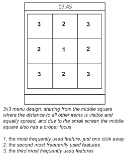
Figure 1 (general structuring of a 3×3 icon menu)
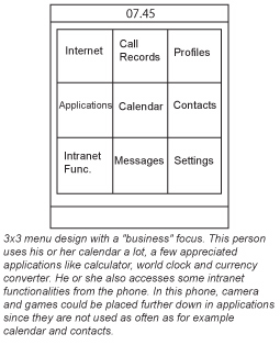
Figure 2 (possible targeted structuring for the ‘business man’)
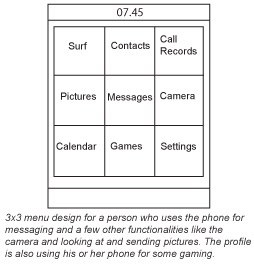
Figure 3 (possible targeted structuring for the ‘young at heart’)
There are no such phones on the European market today and you are quite right to ask yourself, why not?
In an interview with John Geirland, interaction design guru Donald Norman said: “Unless you follow a human-centered design policy, you simply will have unusable devices that alienate consumers. Once you recognise that teenagers are picking up on SMS, the real trick is to make SMS even better for teenagers.”
Manufacturers have tried to support messaging needs with new hardware design for mobile phones (for example the former Nokia 5510 messaging and gaming phone) and gadgets like ‘chatboards’ but they didn’t really take off. I guess using two thumbs instead of one, or a match box-sized QWERTY keyboard is not what makes the whole experience more interesting or easier for the user.
Personally I think people are more driven by what is happening on the screen, how easy and fun it is to read, write and access your messages and all information that belongs to messaging. Manufacturers might think they have already supported this behaviour in current models, but oh no – when it takes 7 clicks to send an SMS to someone in your adress book, you are way off-course.
I wonder when we will see the first phone with a GUI and a functionality dedicated towards enhancing and supporting messaging and chatting? It should have been here a long time ago. There are user profiles out there which would love this.
We do not only differ between modes and profiles within one geographical area, of course we also differ between continents as well. Cultural aspects are very important to consider, and – here also – one can see manufacturers lack knowledge or willingness to support different cultures. It is quite easy to distinguish the Asian manufacturers from the European ones, as their pop culture design values are apparent within their GUI’s, even though they are offered on the European market.
In my recent studies I also researched how Europeans reacted some Asian GUI design. The bright and colourful iconography from a ‘business man style phone’ was considered as fun, but also poppy, chilidish and patronising and, on the whole, not a design they would choose for their phones. However, younger teenagers thought it was almost perfect.
In the upper right corner of the screen on one handset, there was a piece of cake symbolizing menu level. If you were at the top level of the menu, the piece of cake was untouched, when you went further down the hierarchy someone had eaten from the cake, and eventually there were just a few crumbs left on the little plate. I think this analogy was very cute and creative, but at the same time not very intuitive and useful for a European audience. Without research, no one would know that if an Asian manufacturer offered this to a European, he or she would freak out, and if a European manufacturer skipped this part when designing for the Asian market, Asians would find it very non-creative.
I am not saying you should eliminate the values of a brand completely when going to another market, but balance is important, and through research and testing, and a serious focus on graphic and interaction design, you will find out how to accomplish that balance.
When I visited Cebit a few weeks ago, all I could see were more or less generic colour screen phones, with graphics and contents so similar to each other that I suspected the same guy designed them all. It was so boring that I nearly fell into a coma. I wonder if any one at the show had read the latest news from Donald Norman, “Aesthetics matter: attractive things work better.”
As the content and the services get richer, the focus of the mobile industry should shift from hardware design to interaction and graphic design, or rather the balance of exterior and interior design. This should be a no-brainer. But the art of designing usable, useful, beautiful and differentiating GUIs seems to be a complicated issue still.
+ There are no comments
Add yours