There was a sense of desperation creeping in. I’d started ignoring those seemingly innocent and yet surprisingly consequential ‘Tick here if you’d prefer not to receive…’ boxes, simply because they were too small and awkward to navigate. By the end of the exercise, I think I was signed up to offers from Waitrose Groceries, John Lewis Retail, John Lewis Financial Services and had even joined the myWaitrose loyalty programme in the hope it might let me advance a little further towards to my actual goal – buying a case of wine for Christmas.
All told, I’d been on their site for half an hour and with success still a distant prospect, my need for a large glass of that wine was growing stronger by the minute.
This is 2017 and somehow I’d imagined one of the country’s largest retailers would have nailed the basics of selling online in time for Christmas. Instead, I found a disjointed, broken customer experience where a surface skin of modern responsive design was interrupted by legacy assets stuck in a desktop-only time warp. Furthermore, the basic task of buying some wine and using a special offer code had revealed problems that went deeper than just poor digital implementation – there was also an obvious structural disconnect between what was happening in the different internal teams responsible for promotions, design and e-commerce fulfilment.
Multi- or omni-channel architectures, whereby a retailer assumes customer journeys will begin and unfold across a variety of touchpoints, are hardly cutting edge news. The techniques for achieving them are widely understood, the user behaviours are already established in the consumer mainstream and there are plenty of benchmark examples to inspire slow adopters.
The basic principles are simple and something we’ve been exploring in the MEX community for over a decade:
- A customer’s journey may begin on one touchpoint and end on another, e.g. an order initiated on a tablet may be completed on a laptop.
- Each touchpoint is functionally optimised for its own unique characteristics, e.g. the order page on a smartphone should be formatted for its smaller display.
- Services which support the customer journey, from special offers to technical help, are consistent and omnipresent, e.g. an offer sent by post should be redeemable online.
If you’d like, I’ll take you on a tour of my customer journey through Waitrose’s very own winter wonderland to illustrate how even one of the UK’s leading retailers is struggling to respond to the challenges of multi-channel experience design. I should warn you, however, that along the way we’ll meet various Grinches and Ghosts of Christmas Past, including the Terrors of Tiny Text and a Snowstorm of Sub-optimal Page Design.
The customer journey
It began with a paper voucher and the promise of great things: ‘£60 off’ was the headline, emblazoned in red above a deliciously tempting smorgasbord of Christmas fodder. I can’t remember whether it arrived in the post or fell out of a magazine, but along the bottom it had 3 neatly perforated coupons, each giving £20 off a first online shop at waitrose.com. The small print read ‘Minimum spend £80, order must be placed for delivery by 21st December’.
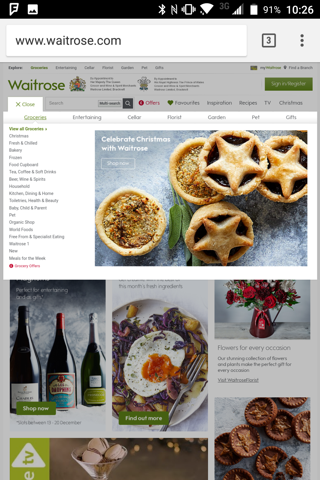
So it was I found myself sitting in my kitchen on the morning of Saturday 16th December, voucher in hand, ready to order my case of wine in good time for Christmas. I fired up Chrome on my Blackberry Keyone – a 2017, Android-based smartphone with a 1080p screen – and navigated to Waitrose.com, expecting to find a site neatly optimised for the small screen. Instead, it was laid out in full desktop mode, complete with tiny text and menu links so small I had to pinch to zoom to be able to select the one I wanted.
I tapped on ‘Cellar’ to access their wine section and watched as the browser loaded all the content for the desktop version, only to then reformat itself in a quick refresh to a layout better suited to mobile. This is an inefficient technique, missing the opportunity to enhance loading speed by only transmitting assets optimised for mobile. Instead, it transfers all of the data for the largest possible page size by default, regardless of device type. It then relies on client-side reformatting in the browser to perform the layout for mobile, which introduces further latency by taxing the local processor and memory resources of the smartphone. It also produces a distracting visual effect of the desktop site flashing up first, then seeming to load the new, mobile-formatted page without the users intervention – I’ve seen users react negatively to this again and again in testing sessions, with a sense of confusion as to whether they’re being taken to a different site.
The menus I navigated to locate the product were now shown in a mobile-optimised layout, but as I tapped through to the product page itself, it went through the same cycle of loading the full desktop version, flashing up a refresh and eventually presenting me with the mobile view.
I added a case of ‘Crisp fresh white wine’ and the action was confirmed with a floating bar at the bottom of the screen that had to be manually dismissed with a small ‘Close X’ in the top corner – a design suitable for mouse and pointer interaction, but hardly best practice for the kind of fingertip-sized touch controls users prefer on mobile.
I navigated to the checkout, which again went through its cycle of ‘desktop-first, then refresh to mobile’, but even the mobile version used desktop-style font sizes so small they were difficult to read.
I was nearly there. I just needed to enter my discount code and get my £20 off. I typed in the code and tapped ‘Apply’. Up flashed a yellow warning, complete with an exclamation point and the message: ‘The promotional code you have entered is either not valid or has expired. Please check the code and try again’. I tried each of the 3 voucher codes on Waitrose’s paper flyer and received the same error every time.
My mind went back to my initial choice of the ‘Cellar’ section. Maybe this was a different department and the voucher was only valid for Waitrose groceries? Surely they wouldn’t have one part of Waitrose.com which sold wine through one channel and another section which sold it through an entirely different one?
I went back to the Waitrose.com homepage, again pinching and zooming on the screen of my smartphone to hunt for what I wanted in the desktop view it presented. Buried in the text-based, non-touch optimised menu was another link: ‘Beer, wine and spirits’. Maybe this was where I could buy my wine?
I tapped on the link, but because I’d needed to zoom in so close to select the correct control, I couldn’t see the next branch of the menu tree. It loaded in the virtual, invisible space off to the right of my screen. There were 3 more levels of this tree structure to negotiate, each time loading the next branch on a part of the virtual canvas I couldn’t see.
Eventually I arrived in this new wine section, which offered a different selection of products from the other bit of Waitrose.com I’d been using earlier. The novelty was beginning to wear off and festive cheer was swiftly ebbing. I hastily added 12 bottles of Sauvignon Blanc, offered at a 25% discount.
Clicking through to the checkout, I was asked to verify Waitrose could actually deliver to my area by entering my postcode, then transferred to the standard new user sign-up flow. By now thoroughly disenchanted with the whole experienced, I skimmed through it as quickly as I could, agreeing along the way to receive offers from various parts of Waitrose and its partner companies that I didn’t really want and not bothering to uncheck the default selection to register for their ‘myWaitrose’ loyalty scheme.
Completing the application for ‘myWaitrose’ transferred me to a new section of the site and this time it was very obvious there hadn’t even been an attempt to optimise for mobile – it was back to a desktop-only layout, complete with text and buttons too small to tap and sections of the interface which loaded off to the side of the screen where they couldn’t be seen.
Finally registered, I found myself dropped back into the mobile-optimised product pages and I tapped on the checkout icon in the hope of ordering my wine. A few more taps and I ended up on a calendar screen where I could select time slots for delivery – except…there weren’t any. There was nothing the next day, nothing the day after…the earliest they could deliver was 28th December. At this stage I nearly abandoned, but I decided to persevere, reasoning we could have some different bottles at Christmas and the wine from this order could be used later.
I confirmed the delivery slot and found myself dropped out of the neatly optimised mobile flow and back into hard to navigate, desktop-only pages. Back I went to the checkout and there, in text just big enough for me to be able to read its frustrating content, was a new yellow warning message: ‘Some offers will have finished before your delivery date. Select a date no later than Tuesday 26 December to get this offer’.
Apparently I was no longer allowed to order the wine I wanted because Waitrose didn’t have the delivery capacity to get it to me before the offer expired. The offer was contingent not on circumstances under the customer’s control, i.e. when I was placing the order, but rather on circumstances under Waitrose’s control, i.e. when they would have enough delivery drivers. It is hard to think of a neater metaphor for an organisation which is thinking inside out rather than outside in.
By now I’d decided I would not be buying my wine from Waitrose – today, or likely ever. However, in the interests of thoroughness and research, I pushed on to see whether the voucher code which had lured me into this forsaken quest would be accepted at the checkout. I continued through, agreeing to forego the 25% discount I was no longer allowed because Waitrose couldn’t deliver on time and entered my voucher code. Success! The code was recognised by this part of the site and added to my order…showing a value of precisely £0.00. I can only surmise that the 21st December date mentioned on the voucher also related to when their van could get here, rather than when their customer placed the order and therefore the £20 value of the coupon was rendered null and void.
Ironically, that voucher value of £0.00 is also the exact same amount I will be spending this Christmas – and for the foreseeable future – with Waitrose.com, John Lewis, John Lewis Financial services and the various other subsidiaries I will not doubt be receiving mailers from in 2018.
While I have picked on Waitrose in this uncharacteristically Scrooge-like report, unfortunately it is hardly an isolated example. All around the world sites which transact billions in holiday sales are losing business to broken links in the customer journey. It serves as a timely reminder that even as we enter 2018, there are tremendous opportunities for growth through improved experience design.
Crucially, we must remember that this is now primarily a challenge of strategy and organisational culture. The technologies to smooth these customer experiences have existed for some time. Best practice techniques for implementing them in a user-centred way have largely been defined. These days the problems most often arise from leadership which continues to treat ‘digital’ as a departmental silo rather than seeing it for what it is – part of an integrated skillset unified in support of better user experience.
Drop me a line if you’d like to talk about how MEX advises companies in a wide range of industries on experience-led design strategies which deliver long-term, defendable competitive advantage.
p.s. MEX is taking a break from publishing over the holidays, returning on Wednesday, 3rd January 2018. We wish you all a Merry Christmas and Happy New Year.