
Conveying reassurance in mobile user experience
I can see it breathing out of the corner of my eye, pulsing with a rhythmical glow to assure me it is alive, connected and ready. The glow captures a small amount of my sub-conscious attention as it sits there on the corner of my desk, ensuring the bond is maintained between us, reassuring me it is ready should I need it and yet, perhaps somewhat worryingly, it also tethers me – keeping me aware I must respond if the glow changes to a faster, more insistent flashing.
The ‘breathing light’ found on devices such as Nokia’s E71 is an example of an often forgotten aspect of the mobile user experience: reassurance. These elements sometimes have no direct functional role at all, but simply serve to comfort the user, subtly communicating that all is as it should be.
As digital devices, particularly mobile ones, become more deeply embedded in our lives, the requirement for these reassurance indicators will grow in tandem with our dependence on the tide of 1s and 0s which increasingly define the ebb and flow of our existence.
The earliest examples I can remember in mobile date back to the Ericsson handsets of the mid-1990s. Each was equipped with a tiny LED indicator on the top of the device, which would wink at regular intervals to remind you it was connected to the network. Motorola developed this further, with its Timeport design (an early ‘world’ phone, when devices supporting networks in both Europe and the US were still a rarity), which was able to change the colour of the LED from green to orange when roaming on a foreign carrier.
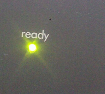
We are also surrounded by examples in the home and the office. The fax machine on my desk is currently shining a tiny green light at me with the legend ‘Ready’ written above it, letting me know it could report for duty at a moment’s notice. The television’s red ‘standby’ light glows constantly, telling us all it is ready for action when required. When we lift the receiver of a fixed line telephone, the low hum of the dial tone communicates everything we need to know about the network – it is waiting to connect us.
More recently Nokia’s high-end 8600 handset has provided an excellent example of how a reassurance indicator can become part of a device’s aesthetic. In standby mode, the whole keyboard of the 8600 glows gently beneath the smoked glass keypad protector, creating a key part of the handset’s visual statement.
These indicators manifest themselves in rather different ways when it comes to software. The network coverage bars and battery indicators found on all handsets are the most obvious examples of reassurance elements which have been abstracted into a virtual interface. At a glance, we can tell whether the device is able to make calls and whether there is enough power left to last out the day. The mobile phone clock is also a good example and one now widely used in preference to a wristwatch by many younger customers.
We might also class the rotating, circular progress indicators found in MacOS, iPhone OS and Android devices in this same category. They fill the latent periods between an input being made and an output being received, reassuring the user that something is happening in the background.
Perhaps I am reading too much into it, but I would suggest you can see some interesting philosophical differences between the way Apple has designed (perhaps over-designed?) the spinning, multi-coloured disc used in MacOS and the old hour glass indicator employed by Microsoft. Could beautifying such a small element of the user experience really make a tangible difference to the way users perceive a platform?
When creating mobile user experiences it is easy to focus purely on the feature-driven elements. The flow diagrams used to design the functions of an application often have no place for elements which sit outside the main interaction architecture, yet in the user’s mind these seemingly insignificant reassurances can make the difference between a service which feels well designed and one which seems too technical and cold.
Over time, such elements can also start to have a significant influence on user behaviour. Personally, I have become attuned to the breathing light on my E71, sub-consciously waiting for it to call for my attention when new email arrives on the device. There is also a well documented phenomena of people experienced ‘ghost rings’ and even ‘ghost vibrations’, where customers have become so acutely aware of their device’s indicators that they start to imagine non-existent sounds and sensations.
This is causing some people to make small, yet significant gestures to indicate when they are ‘disconnecting’ from the wireless world for a while. For some, this manifests itself as turning their device screen side down so they can no longer see the glow of the display or breathing light, signifying to themselves and those physically present that their attention is now solely on those in the immediate vicinity. An obvious extension of this would be to allow users to automatically change their presence status from ‘available’ to ‘busy’ when they make this gesture.
I’d like to suggest a few further points for consideration to advance the discussion about these reassurance indicators, and would very much welcome your feedback on the blog, Twitter (@marekpawlowski) or by email (mp@pmn.co.uk).
- Should a reassurance indicator always have a secondary functional purpose, e.g. a breathing light which flashes with different levels of intensity to alert you to new messages, or can it exist simply for the purpose of establishing a bond of confidence with the user?
- Are reassurance indicators best appreciated in analogue form, such as a physical dial or light, rather than being abstracted into the virtual domain of software?
- What other senses should reassurance indicators target beyond the visual? Do touch and sound also have a role to play in forming this part of the user experience?
With thanks to @aaron_rustill, @tomiahonen, @power2b and @mysticmobile for their helpful Twitter responses when I was researching this article.
Should a reassurance indicator always have a secondary functional purpose, e.g. a breathing light which flashes with different levels of intensity to alert you to new messages, or can it exist simply for the purpose of establishing a bond of confidence with the user?
Are reassurance indicators best appreciated in analogue form, such as a physical dial or light, rather than being abstracted into the virtual domain of software?
What other senses should reassurance indicators target beyond the visual? Do touch and sound also have a role to play in forming this part of the user experience?
I find these so called reassurance indicators to be noting but annoying. They serve no purpose and convey no meaningful information.
The worst thing is that on many devices you can’t even turn them off. The worst offenders are 3G dongles and old devices which use harsh LED lights for this.
I actually had to tape over the indicator ligth on my old 3G card to keep from snapping it in two.
I only turn my mobile upside down when I’m charging it overnight. This is due to the idiot from Nokia who decided it is a good idea to light up the screen and beep when the battery is full.
You can imagine what happens during the small hours of the night, if you forget to put the phone on silent, when an older battery can’t hold a full charge for very long and keeps getting a bit of charge to fill up over and over again.
So to sum it up, reassurance indicators are useless, not all people want them and they should always be a way to turn them off and Nokia should be banned from ever again making any software for any phone.
– Zed
Interesting point Zed. My understanding is that most newer Nokia handsets have solved this ‘beeping in the night’ problem, but it provides a useful illustration of why context is useful in all aspects of mobile user experience design. Either the user must be given full control over these settings or the phone needs to be smart enough to know it is night time and switch off the beeps.
Another side of this is handsets which fail to play the alarm clock noise when they are set to silent. The user puts the phone into ‘Silent’ mode before they go to bed to ensure they are not disturbed by calls during the night and then finds they oversleep because the alarm doesn’t sound…
I see your point Zed and have experienced the same frustration with past phones going bump in the night. But to generalize that and say that all reassurance indicators have no purpose and convey no meaningful information is taking it a little far. It sounds more like they have just annoyed you to the point that you block them out. But that is just the way that the (ill-advised or non-comprehensive considering) designers behind those indicators made them behave badly. A recent iPhone convert told me that the one thing he missed in his new phone was the message indicator light. Clearly it served a purpose for him.
All reassurance need not be communicated through hardware, as Mark points out (battery level, network signal strength). One that I have found very reassuring is the shaky, twitching icons on the iPhone home screen(s) when you press and hold one–makes it super clear that you are in a special rearranging/cleanup mode (what some might call a dangerous mode).
And speaking of the alarm clock and silent mode, I actually used to rely on this alot: back in the college days if I had an hour between classes and it wasn’t worth heading back home, I would go into the library and find a comfy chair to catch some zzzz’s in. Not wanting to miss the next class, I would always set my phone’s alarm. Not wanting to cause a scene in the silent library, I used the silent vibrating mode of the alarm to have it gently wake me from my pocket. That was an early Ericsson phone I believe. My situations have changed over the years though and I haven’t needed that feature in a long time. Glad that my iPhone overrides the silent setting and plays the audible alarm.
I know we are talking semantics here, but one should differentiate between reassurance indicators and status indicators.
From the original post on reassurace indicators:
“These elements sometimes have no direct functional role at all, but simply serve to comfort the user, subtly communicating that all is as it should be.”
This is the very definition of useless and should always be something the user can turn off.
Status indicators, such as message indicators or field strenght icons, convey information and are far from useless.
Bad design always makes me cranky and doubly so useless bad design.
– Zed
I wouldn’t go as far as Zed and call the reassurance indicators useless (I can see them being a comfort to some people), but personally I like the more minimalistic approach of “no news is good news”.
I simply trust that my phone is connected to the network (as it is 99.5% of the time – at least in Stockholm, Sweden where I live). No confirmation is needed.
The blinking indicator on some phones reminds me of those pesky balloons that keep popping up in Windows all the time (“New hardware found!” – no, it’s my trusty ole usb memory, stupid. “Connected to the wireless network” – yes, I know thank you. I always use the laptop here at my office desk… etc. etc.)
Unlike outraged Zed here, I like some reassurance indicators. They reassure me in times when I know I can’t necessarily rely on the good times always rolling.
But I would like to relate the most poorly designed reassurance indicator I’ve ever seen: the ‘on’ light for a set of Bluetooth headphones. When the headphones were connected to a Bluetooth source, a massive ring of bright blue light would flash at about 1Hz from the outside of one of the ears. It was so bright I could see it reflected in the faces of nearby people. I was so embarrassed by being a human lighthouse that I simply couldn’t use the headphones, devastating when I’d paid £120 for them. I actually contacted Plantronics to complain about it and they said “how else would you know it was turned on?” They could not conceive of anything more subtle.
The lesson: reassurance indicators must be subtle. Their very nature dictates that they have no need not to be