
Reviewing the user experience of HP’s WebOS TouchPad
HP’s TouchPad rewards users willing to invest a few minutes familiarising themselves with the unique characteristics of WebOS.
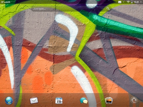
The initial set-up is simple, with the core applications of email, browsing, contacts and calendar immediately accessible at the top level of the interface and intuitive to understand. However, it is once you start to dig deeper that WebOS unfolds a rather special canvas of new visual metaphors, gestures and interactions.
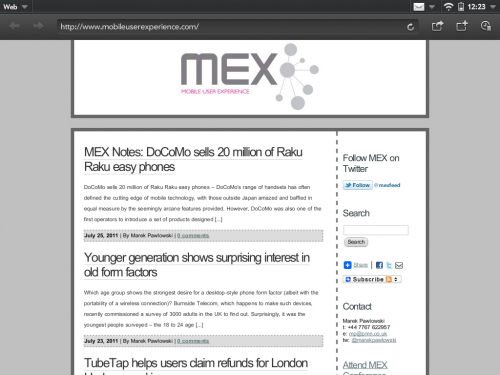
The browser is a good example of this two-tiered learning process. Initial access is conventional and obvious: the first icon on the opening screen is a typical browser globe. It opens a traditional looking web browser with an address bar at the top and a few icons for bookmarking, sharing and opening new browser ‘cards’. Every user I tested got the page they wanted first time, without prompting.
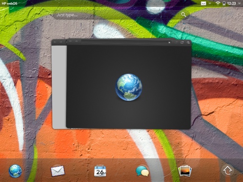
The additional potential of the WebOS ‘cards’ is less apparent and requires some tuition, but starts to reveal itself when new browser tabs are placed in their own individual ‘cards’.
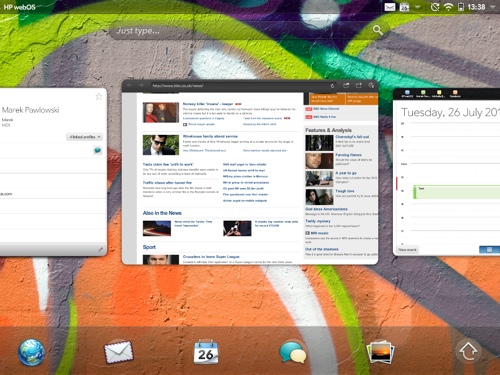
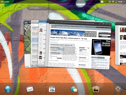
These cards are the most obvious visual difference between WebOS and competitors such as iOS, Android, Windows Phone and Symbian. For PC users, the easiest frame of reference is to imagine each WebOS card as the ability to run multiple copies of the same application simultaneously.
However, unlike PCs, each card exists at the top level of the UI. They are best thought of as containers for individual activities. You might have several web page cards open, alongside a potentially infinite number of other cards from apps such as email or contacts. Pressing the home button (or swiping up from the gesture area) brings up a carousel of all your cards. Each card can be dismissed by flicking it towards the top of the screen.
I found this design approach the best I’ve seen in an operating system, but I’m also conscious I came to the TouchPad with existing knowledge of how it works. New users required additional prompting and it is surprising and disappointing HP did not include an interactive lesson on this aspect of WebOS as part of the initial set-up. Taking new users through this step-by-step when they first activate their device would require just a few minutes but pay immediate dividends by helping users understand the potential of the interface.
Cards can also be arranged in stacks, enabling related items to be grouped together. WebOS takes intelligent decisions about this on its own. For instance, open a link from an email and the resulting browser card is automatically stacked with the message. The same is true of contact information. Users can also organise stacks for themselves, by long pressing on the relevant card in the carousel and positioning it in their chosen stack.
For instance, a user about to visit a client may choose to open several cards to show the client’s contact information, web page, a recent email and a document. All of these could be positioned within a single stack, while other activities unrelated to the client could be kept in their own cards or stacks.
The WebOS approach of organising each activity into its own card is more logical than keeping activities locked within application silos, as per iOS and Android. Switching between activities is more intuitive because the individual cards or stacks are all ranked with the same priority and all show a thumbnail representation of the exact material the user was working on.
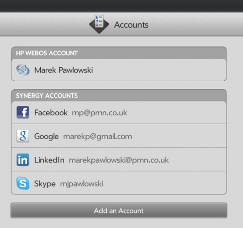
The logic of this approach extends beneath the UI layer. Accounts for services such as Skype, Google and Facebook are added centrally and WebOS uses its Synergy technology to manage them and make the data from these services available to other applications. Synergy also makes intelligent decisions to link multiple profiles into a single, consolidated record for each of your contacts. If you’re connected via LinkedIn, Facebook and Google with the same person, Synergy will present all of their information in one integrated view.
In a few week’s usage, I found Synergy reasonably proficient at managing a complex network of a few thousand contacts across several services. However, I did notice other devices (e.g. my Symbian 3 phone) synchronised with the same services started to receive abridged versions of existing contacts.
The concept of Synergy is highly desirable, but for it to succeed, HP needs to ensure any inconsistencies are eliminated. There is no quicker way to make yourself hugely unpopular with your users than messing up their address books. Based on my own experiences I could not recommend it without reservation, especially if you are synchronising multiple devices, running multiple OS, with the same back-end services. Currently users must make a calculated decision on whether the benefits of having neatly integrated profiles on WebOS outweigh the risk it will disrupt contact records on their other devices.
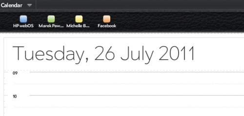
With that caveat aside, WebOS’ centralised management of network accounts works in most other areas. Once I’d added my Google and Skype account details, the calendar, address book and messaging application populated quickly and without any further action on my part. Within a few minutes of set-up, I found Google Talk messages, Skype calls and IMs all arriving within the same integrated messaging application. The calendar showed entries from my own diary, those I share calendars with on Google and my Facebook events. Each was colour coded and could be hidden with a single touch if your diary pages started to look too cluttered.
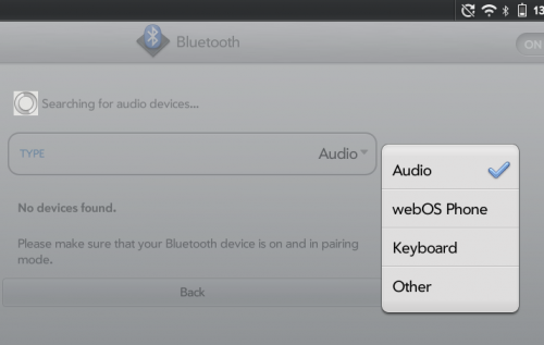
Although I was unable to test the feature myself, users with a WebOS phone (e.g. the Pre or Veer), can also pair with the TouchPad to manage voice calls and SMS. Once the link is established, TouchPad users can place calls through the linked WebOS phone, using the speaker and microphone of the TouchPad for the conversation. As calls and texts arrive, they appear simultaneously on both the TouchPad and the WebOS phone.
This is in addition to the ability to make voice and video calls over Skype using the built-in camera of the TouchPad.
Further integration comes through HP’s ‘touch-to-share’ feature. Touching the back of a WebOS phone to the TouchPad will transfer the active web page from one device to the other. For instance, if a user has been looking at a page on the small screen of the phone when they’re out and about, they can simply ‘touch’ it across to the TouchPad when they arrive home.
This multi-touchpoint user experience, allowing users to engage with activities across several devices, will rapidly become an expectation among mobile customers. We’ve been looking at the user experience implications of this for some years in the MEX community, most recently as a focus of MEX Pathway #2. WebOS is the first mainstream platform built with this multi-touchpoint approach at its core and this architecture will pay dividends for HP in the future, giving it a competitive advantage over rivals stuck with device-centric platforms.
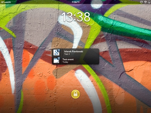
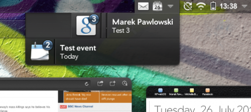
Notifications of new messages, events and emails are managed at the top level of the OS, an approach which distinguishes WebOS from the application level ‘pushes’ in the current version of Apple iOS (iOS 5 will change this). They appear first as icons in the top right of the screen. Click on these and a list will drop down, with events, emails and messages listed on separate lines. If there are multiple notifications of a single type (e.g. 5 emails), you can swipe away each one individually or swipe away the whole list in one go. The notifications also appear as a list when you’re unlocking the device from sleep mode.
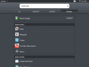
Centralisation is a consistent theme with WebOS. Further evidence comes in the form of the ‘Just type’ bar on the home screen. Start typing in this box and WebOS quickly searches everything on the device and presents the results, separated into emails, contacts, calendar entries and so on. True to the ‘Web’ OS moniker, the platform also makes it just as easy to use the text as a jumping off point to search Google, Youtube, Wikipedia and numerous other sites.
The cards, notifications, centralised search and thoughtful inclusion of a gesture area beneath the main display are testament to the elegance of WebOS. It has an intangible quality to it, one which is not immediately obvious but which becomes apparent the longer it is used. Of all the digital environments in which I operate on a daily basis (Mac OS, iOS, Symbian, Windows Phone and Apple TV), WebOS seems the quietest, calmest and most relaxing place to be. Perhaps most tellingly of all, it is one of the only devices I’ve ever felt able to use for reading before bed, a time when I would normally refrain from any digital interactions in favour of the relaxing paper pages of a book.
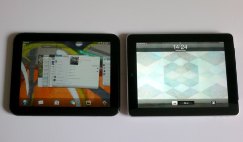
I also find myself choosing it for web browsing in preference to my iPad (the original one). It seems faster, supports Flash videos and I prefer the card metaphor for managing all the pages I have open.
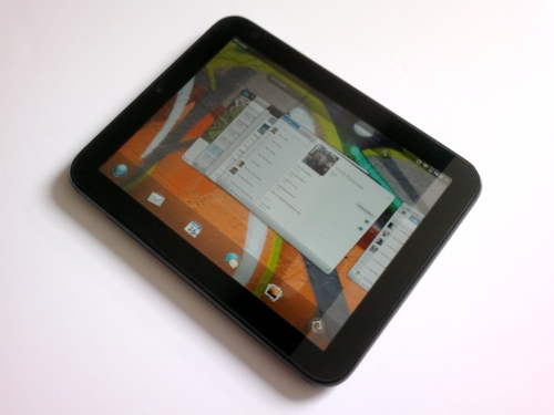
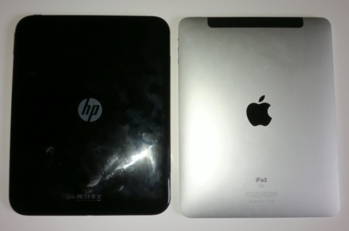
The hardware is unremarkable: an anonymous, black plastic casing with average build quality. Most users I tested it with mistook it for an iPad, an assumption explained in equal parts by the physical similarities between the two and Apple’s domination of this product category.
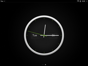
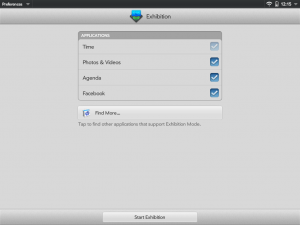
The one significant difference comes via an accessory: the TouchStone charger. This is a desktop easel which incorporates inductive charging technology. Drop the TouchPad onto the TouchStone and it begins to charge. The device also switches into ‘Exhibition’ mode, which is user configurable to show photos, clock, Facebook posts and agenda, turning the TouchPad into a quiet, glanceable information appliance.
It occupies approximately the same dimensions as the first iPad, but is thicker and heavier than the iPad 2. However, I found it more comfortable to hold than both of these and, due to its flatter back, it is physically easier to type with on a flat surface. In contrast, the original iPad was unusable for table-top typing without a case to support it at an angle.
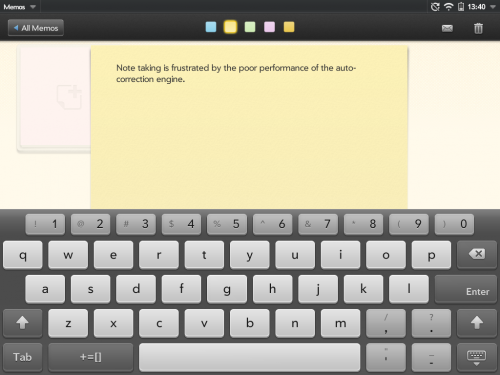
However, I would caution against purchasing a TouchPad in anticipation of using it for significant amounts of typing. The software keyboard is a bad user experience. Like most software keyboards, it easily mistakes which letter you were aiming for. The difference with WebOS is the weakness of the auto-correction engine: iOS and Windows Phone are better, while Android allows users several open market alternatives. Once I’d solved the physical issues of typing on the iPad with an angled case, I found I could trust the correction engine sufficiently to make typing a pleasant experience. The TouchPad frustrates with the need for constant monitoring and manual correction.
Overall, the physical qualities of the device are unsatisfactory and fail to match the elegance of the software. The shiny plastic picks up marks easily and feels slippery. Improving the tactile palette of the device with new materials and colour options should be a priority for HP in the future. I would also like to see a more sophisticated haptic capability on the device: the visual metaphors and gestures of WebOS would benefit significantly from a similarly expressive range of tactile feedback.
The weakness of the hardware makes it unlikely the first version of the TouchPad will sell in significant volumes. I observed several users weighing it against the iPad and the all important initial impressions always favoured the Apple device. The materials of the iPad look and feel better in the hand, it is better marketed with the range of colour case options and has comparable pricing. Put simply, users who see the two together feel they will get more for less from the iPad.
Users who persevere and are able to make the leap of faith to purchase the TouchPad will most likely find their choice rewarded. In day-to-day use, the quality of WebOS outshines the mediocre hardware of the TouchPad and provides a good experience overall. However, while the visual appeal of the TouchPad remains as weak as it is today, few users will ever be persuaded to get to this stage.
Industry observers should take note of the long-term potential for the WebOS platform. In several key areas, WebOS has laid the foundations for creating great user experiences:
- The visual and interaction layers of the user interface are intuitive and elegant. The TouchPad proves WebOS scales well from the pocket to the tablet form factor. I believe, for the majority of first time users, it is the most natural platform currently available.
- The underlying architecture is designed for distributed, multi-touchpoint experiences. As consumer expectations of integration between the disparate digital elements in their lives grows, WebOS is well positioned to deliver successful products.
- The OS is built around web technology and it shows. Developers with web experience are finding it easy to start coding for WebOS and the application catalogue is populating rapidly.
PreCentral has a detailed two part review of the TouchPad, with additional focus on specific applications and features, while The Guardian offers a first time consumer slant on the device. Both are worth reading to give additional views beyond the user experience strategy perspective of my article.
As an epilogue, I would add I am surprised by the several reviews I read criticising the speed of the TouchPad. My experience was of a device which kept a steady and useable speed, even when switching between numerous cards. It was also stable, with only a single restart over a few weeks of testing.

Thanks for the in-depth review.
Glad you enjoyed it. I’ll try to share more thoughts on the device on my twitter (@marekpawlowski) as time goes by.
[…] via: http://www.mobileuserexperience.com/ […]
[…] poor quality hardware and slow time-to-market. The recently launched TouchPad (see my review here) has seen sales well below expectations, while the Pre handset has only just started to trickle […]
[…] might also be interested in my review of HP’s ill-fated TouchPad and […]