Why are these mobile interactions from Apple, Blackberry, Nokia & Huawei memorable?
Small moments of interaction design have disproportionate power to define the overall user experience.
Consider pinch to zoom. There was a time when it was novel, now it is innate. The speed at which it has become part of human behaviour tells us, with the benefit of hindsight, how effective it was in channelling latent paths of acceptance within the brain.
By looking at other examples – from the likes of Apple, Blackberry, Nokia and Huawei – we may discern the common characteristics which turn digital interactions into human habits – and learn how to apply them to future interaction design work.
Blackberry 10 Hub swipe
Blackberry Hub is a universal inbox which can be reached from any screen on a Blackberry 10 device by swiping up and to the right. It exists in a conceptual space that can always be thought of as to the left and just underneath the current screen. With Blackberry’s reputation for messaging and productivity, it ensured a key feature was always accessible and progressively glanceable by revealing just a hint of the Hub with a partial swipe.
- Surfaced a key capability of the overall digital experience with a memorable, universal gesture.
- Relied upon a unique gesture that resonated with the conceptual model of the Blackberry 10 UI.
- Integrated with the overall gestural model of Blackberry 10, such as the ability swipe up to wake and unlock devices.
Huawei fingerprint swipe for notifications
Most Huawei devices provide access to the Android notification menu by swiping downwards over the rear-mounted fingerprint scanner. It solves a design flaw within Android, where accessing notifications requires an uncomfortable shift in grip to pull down notifications from the top of the screen. Google has subsequently adopted this gesture for its Pixel handsets and it seems likely to be rolled into future releases of Android.
- It shortcuts a common need by leveraging the physical convenience of the fingertip’s natural resting place on the rear-mounted fingerprint scanner.
- The gesture satisfies the interaction model of the operating system, where notifications exist in a conceptual space above the main screen, accessed by pulling down.
- It derives additional utility from an essential, but previously single-purpose hardware sensor.
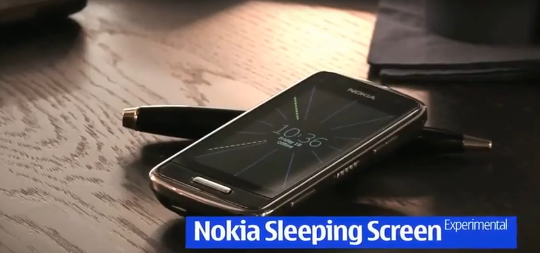
Nokia Glance screen
Nokia introduced the concept of an always-on display to show essential information back in the days of its Symbian handsets. The implementation has varied from simply showing the time & date to more whimsical interpretations allowing notifications mixed with dynamic imagery. It is still available on the Lumia products Microsoft acquired from Nokia and has been copied by Samsung and LG for its flagship Android devices. It responded to a basic user need: finding out the time or seeing if you’d had missed a notification without unlocking the smartphone.
- Enabled by low power modes in touchscreen displays, whereby only the live pixels needed to receive power, while the rest remained dormant. Without this hardware innovation, the battery drain would have been too high.
- By adding a persistent display, it changed the overall role of the smartphone from a device which required engagement, to a device which could be useful at a glance.
- The concept was counter-intuitive, resulting from the designers asking themselves how they could reduce, rather than increase, interaction with the product.
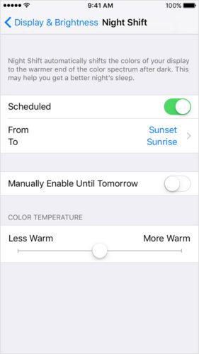
Apple Night Shift
Apple’s Night Shift gradually adjusts the colour temperature of users’ displays, removing blue light as night falls, helping users maintain natural sleeping rhythms. Once activated, it looks after itself in the background, quietly improving the experience of using digital products after sunset.
- Inspired by nature and synchronised with users’ body clocks.
- Hides the complexity from users by distilling the capability into a single opt-in moment.
- Does not require ongoing maintenance or attention.
Peter Skillman, now leading UX for Microsoft’s platforms, spoke at MEX/14 about the importance of elevating the mundane, repetitive actions users perform most frequently to the status of ‘beautiful essentials’. Such elements of the user experience are harder to advertise as features within themselves. However, they create a sense of quality which – at its best – resonates with users until it becomes a deep, long-lasting connection to the product.
What is your most memorable example of mobile interaction design? Post a comment on the blog below or tweet @mexfeed.


+ There are no comments
Add yours