Most users are creatures of habit. They access features through familiar patterns and become wary of change. This makes it challenging to introduce new capabilities without disrupting comfortable routines.
Furthermore, for designers and developers, the sense of ownership which results from creating services makes it difficult to empathise with this form of user apathy. When it is your product, it is hard to accept that sometimes – even though the new features are objectively better – users may simply not be motivated to try them.
The perceived risk and disruption of any new feature is inversely proportional to its take-up.
This makes it all the more important to double down on ensuring it takes minimal effort to try new features. It is also essential that new features do not interrupt users’ ability to access other, more familiar parts of the experience and they are seen to be reversible.
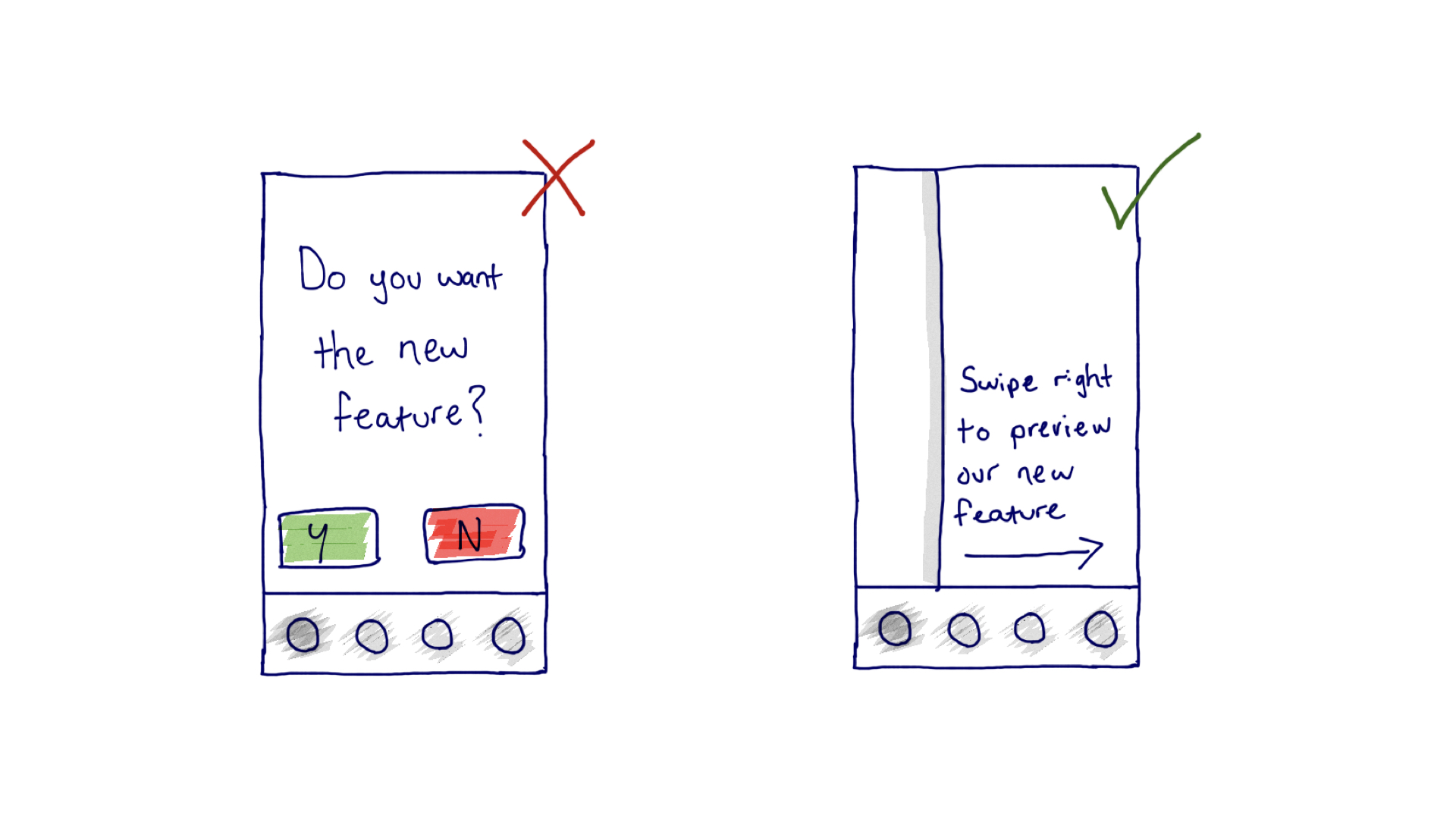
In this sketch example we show the difference between showcasing a new feature with an interrupt screen, versus hinting at the possibility to preview a new feature with a reveal screen. Importantly, the interaction flow of the latter allows the user to maintain visual contact with their familiar UI and slide back to it at any point.
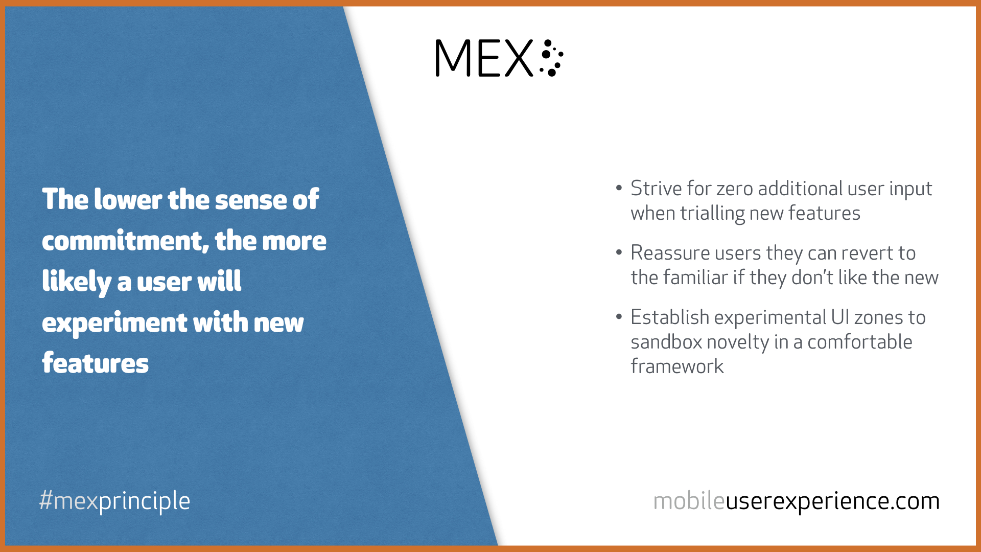
The principle, part of an emerging series in the MEX journal, is summarised below in a tweetable, shareable graphic. Thank you for citing appropriately.
Mirren Fischer is someone who finds herself at the confluence of some really big challenges:…
Poetry and place...listening and lockdowns... Dan Phillips, who led the Royal College of Art's (RCA)…
Mark Baldino's path to co-founding a Chicago-based design agency wends its way from a degree…
Paul Campbell, a former chief designer at Ford, is now re-imagining the wheelchair at Centaur…
Opening the oven released a cloud of steam. I should have been expecting it. It's…
Jared Ficklin's approach of 'think by making' has led him to produce remarkable digital design…