

Failing to engage users through NFC, QR & SMS

What’s wrong in the photo above?
To provide some context, it is a scene I encountered on a train journey in the UK, where there was an advertisement positioned on the wall facing my seat, accompanied by an ‘action point’ with an NFC tag, QR code and instructions on how to send an SMS to a shortcode.
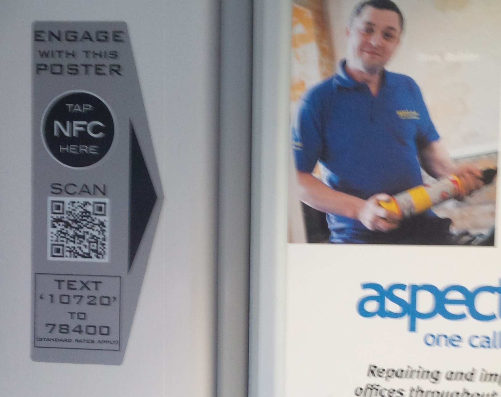
The action point invites users to ‘Engage With This Poster’, but I’d guess it has led to no ‘engagements’ whatsoever for a few simple reasons:
- The NFC tag did not work
- The QR code is too small to be scanned at a practical distance
- The text explaining the SMS shortcode was too small and faint to read, even with my comparatively young and good eyesight

The diagram above is a plan view of the train carriage, showing the location of the passengers, furniture and advertisement. Consider the user experience for the 3 numbered passengers, if they wanted to ‘engage’ with the advertisement.
Passenger 1, seated in front of the poster, cannot see it to read the QR code or SMS details. The only way they could touch the NFC tag would to reach around at an incredibly awkward angle, twisting in their seat. The situation would be similar for the passenger sitting next to them.
Passenger 2, seated opposite the poster, can see it, but it is too far away to read the SMS details. They might try to scan the QR code, but if someone is seated opposite them, they will be sitting there pointing a camera in their face. As it happens, the QR code was actually so small that it could only be scanned by leaning in until your camera was about a foot away from the advertisement. What about NFC? Well, if I’d have wanted to touch my phone to the NFC tag, I’d have had to lean over Passenger 1 to the degree that my armpit would have been almost in their face to touch my phone to the NFC point.
Passenger 3, standing in the aisle, would face similar challenges to Passenger 2. With the ‘action point’ located in the far corner of the train, they cannot get close enough to see it and it would be impolite and weird to lean in close to enough to touch or scan it.
Once my fellow passengers had left the seats opposite, right at the end of the train journey, I took the opportunity to lean over and test the NFC tag. It didn’t work, presumably because no one had bothered to update it with the correct link.
The QR code did work at close range, as did the SMS shortcode, but both used a web link which seemed unrelated to the advertisement and I suspect would have put off many casual users uncertain of where it was going to lead them.

I wonder how much was spent to install these new ‘action points’ and how expenditure was justified with predictions of increased NFC penetration and demonstrations of QR codes in action. I wonder how many of the advertisers have been sold on the prospect of mobile ‘calls to action’?
The concept of using a mobile device to engage with the physical environment has strong potential and is something we’ve been investigating at MEX for some time, through our events and research. However, it is yet to capture public interest because – like this advertisement example – most implementations have been beset with basic usability problems.
Here are just a few of the design principles which have emerged from previous MEX sessions which could have improved the experience:
- The physical always trumps the digital. Real world, physical constraints – like the etiquette of not leaning over people on a busy train – will always take precedence over even the most compelling digital interaction. No matter how exciting your digital experience, people simply won’t try it if there is a physical or social barrier in the way.
- Trust is established when things behave as you expect them to. If a user is responding to an advertisement from a certain company and you present them with a web link which looks like it has nothing to do with that company, they are unlikely to trust it enough to proceed further.
- Location influences behaviour and introduces constraints. It is almost impossible to hold a camera phone steady enough to scan a QR code on a moving train.
How could this situation be improved? One very simple step would be to do what mobile does best and bring the advertisement to the user, rather than expecting the user to go to the advertisement. Why not simply position to the ‘action point’ with its NFC tag and QR code on the table top, where it is within easy reach of the passengers, instead of next to the poster, where no one can use it?
In addition to our explorations of user experience at the MEX events and in our research publications, MEX also works directly with companies to troubleshoot these kind of barriers to customer engagement. In 2 days, we can identify where a company has a customer experience issue, help management understand its implications and agree a plan to solve it – why not get in touch and challenge us to do it for your company?
Thanks for the field notes, very typical of NFC implementations the world over.
We recently sent a team to South Korea to look at NFC and contactless payments in the wild. While there is far greater penetration of these services in Seoul than anywhere else in the world, that also means there are more ill-thought out user experiences like the one you’ve shared. We even developed a name for this type of implementation: wreckage. All over the city there are badly conceived, poorly implemented, broken or under-supported instances of NFC services. We began to wonder if there’s a phenomenon by which a new technology becomes its own negative advert for itself ( i.e. NFC must be useless because most NFC implementations I encounter are so poor.) In fact, of course, the problem is design not technology. Not enough consideration given to the human-factor as we translate an idea into a working service…
p.s. Marek you should come over and look at our research materials!
‘Wreckage’ is a good word for it. I focused on the train example, but there are several others in the MEX archives, like the ‘tap for the latest bus times at this stop’ which had incorrectly geo-coded itself to a different bus stop several miles away.
Perhaps the underlying problem here is that NFC is just an inappropriate ‘link’ technology in many of the advertising-like scenarios where it has been deployed? Even if the tag on the train had been working or had been better positioned, the action of tapping it doesn’t really add anything aside from novelty. Touching your phone to an advert to access further information just doesn’t feel natural for some reason…maybe it has something to do with how we expect the flow of advertising to work – more push-then-search instead of see-then-pull?
In contrast, something like tap to pair, where a user might touch together their headphones and mobile device to establish a wireless link, feels sensible. There’s also less risk of environmental factors causing it to go awry: the user has physical control of both devices, so can line them up better; the transaction is completed locally without the risk of finding the cellular network has dropped because they’re on a fast moving train; not to mention lower risk of human error, like the maintenance person forgetting to load the correct URL to the NFC tag when they updated the advert!
We’re planning a theme around proximal interactions (working title!) for the next MEX cycle and the event – would love to compare notes.
Hello, I’ve seen a similar installation but in an open section, the wheelchair refuge bit. I’m not sure if it made it better or worse. Don’t have NFC to try that, we code on an iphone is clumsy and didn’t want my number harvested my SMS so left it.